

Your RIA should be a RIA
Any RIA [Rich Internet Application] developer should respect the word “Rich”. A RIA should have richness which can increase an application’s business values. In context of RIA, richness menses greater UI design, innovative navigation, user friendly inputs, optimized downloading, and quality feedback to user. All these elements impart great richness to the application and results into a joyous experience for both, the client and the user.
The paragraph, above, says nothing new. All of us know these facts and that’s why we are in RIA domain. But the thing is, do we really follow this kind of an attitude while developing an application?
Here, let me try to figure out few aspects which can really bring smile on a user’s face.
Spend special time to understand navigational flow
This is very important aspect for RIA - “navigational flow”. Which control shall we use to provide better navigation - Accordion, Tab Bar, Toggle button bar, Link bar or Menu bar. This depends on your application and the layout you have created.
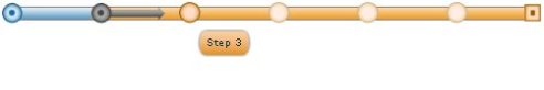
In some cases, you have to think beyond these components. Let’s say you have to create checkout functionality of the shopping cart. This checkout form has seven steps to follow.Now, which component will you use?
Accordion? Nope that will takes much of UI space.
TabBar ? hmmmmm……………. No that will not give the feel of sequential steps.
ToggleButtonBar ? it has the same problem as TabBar.
Which navigation control should you use. . …………….Simple answer you have to create your own stepper component which may look like the image below.
The moral of the story is, think beyond the flex frame work to provide innovative navigation. Believe me that makes so much difference in a client’s satisfaction
Respect your UI designers and creative people
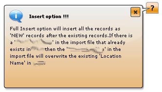
Generally the very first step of any application development is a mockup design. At that time you will find your “UI designer” busy with an image editing tool like Photoshop or Fireworks. Once through, he will approach you with some kind of designs, which you think are not feasible to develop using the flex frame work. For example the UI designer may come up with something like following component for providing help, warning or instruction.
At first look, you may simply refuse this idea by saying like, “we can just put tooltip over here. So please design accordingly.”
Rather then saying No to creative idea, you should say, “Hmmm. Let’s do it.”
Keep the targeted user, in mind
One day I was creating a small e-learning application for children of the age group of 10 years. I had created very cute navigation with collapse functionality. I had just put “<<” and “>> ” kind of icons on collapse button with width and height of 10 X 10 pixels. Suddenly our CEO passed from my desk and reviewed that navigation part.
He gave me suggestion to create 30X100 pixel buttons and write “CLOSE” and “OPEN” on the buttons. I said why? It was easy to understand by the means of the icons. He told me, as an IT person I knew this is “collapse menu button”, but a 10 to 15 years child would never know why this button was and what it meant

Signs convey a lot of things, in a very salient mode
Use icons where ever your application requires.
Icons sites


Get inspired from other applications
Before create any application we should spend time to see other, applications, UI designs, how they done this.
Below is the links from where you can get inspired
0 comments:
Post a Comment